Learning to Do Historical Research: Sources
Quantitative Evidence
Learning to Link Qualities to Quantities
Jacquelyn Gill
Abigail Popp
Introduction
As you go through the research experience, you collect an arsenal of information from a range of sources in order to build an argument. Often, the more information you collect, the more you think you need; during the course of your research, you may find yourself asking questions like:
- Did Chicago’s demand for lumber increase or decrease after the Great Fire of 1871?
- Exactly how dry were the Dust Bowl years in Nebraska compared to the climate of 1900-2000?
- Is there a correlation between the number of McDonald's food chains over time and the amount of beef consumed by the average American?
These questions can all be answered with quantitative data taken from a variety of sources. Quantitative data are collected in order to answer questions of how much of a particular thing exists (i.e., How many cows does Old McDonald have?). Often, researchers are interested in how these totals change through time (does Old McDonald have more or less cows than last year?) or across geographic space (does he have more cows in the upper or lower pasture, and what breed are they?). In contrast, the term qualitative data is used to describe information based on the qualities or properties of something, which may be less precise or more subjective than quantitative data.
Why is it not enough to say that the popularity of fast food chains increased American consumption of beef? Why can’t you simply say that the Dust Bowl was dry—really, really dry? Of course you can, but you probably won’t want to, and this page will show you why.
Table of Contents
Why You May Need Quantitative Data
Telling a story about “the one that got away” may be more exciting the less precisely you recall what actually happened, but academic arguments aren’t fish tales. Your research question may require concrete evidence to either back up a claim or to strengthen a particular point. You may find yourself needing quantitative data to:
- Make a stronger case or illustrate a point effectively and precisely
- Provide information when qualitative sources may be incomplete or lacking
- Augment or help interpret qualitative accounts
Make a Stronger Case or Illustrate a Point Effectively
Because terms like “a lot” or “many” or “strongly” can be relative, backing up your claims with actual data not only gives your reader a clearer understanding of just how many “a lot” actually is, but it’s just plain good scholarship. 
A Confined Animal Feeding Operation (CAFO), or feedlot, in Texas
Wikipedia Creative Commons
In Down to Earth, Ted Steinberg discusses the influence of fast food chain McDonalds on the American consumption of beef (which he argues has important implications for the nation’s natural resource consumption and American relationships with nature). Here, Steinberg employs a series of facts taken from quantitative sources to impress upon the reader just how many “a lot” of hamburgers is:
“In 1972, [McDonald’s] became the largest meal-serving organization in the nation. In 1976, when beef eating in the United States peaked…McDonald’s was selling more than six million hamburgers a day. By the late 1990’s, one in seven visits out to eat found the American consumer headed for its Golden Arches. The orgy of hamburger-eating has helped make McDonald’s the world’s largest beef buyer, relying on the slaughter of three million cattle each year in the United States alone.”
Steinberg’s argument depends heavily on his use of data—each sentence contains a reference that traces back to quantitative research or data collection. An “orgy of hamburger-eating” is a dramatic metaphor and one which readers are more likely to accept given the supporting evidence of large-scale consumption.
Provide Information When Qualitative Accounts are Incomplete or Lacking
Fifteen thousand years ago, northwestern Wisconsin was buried under an ice sheet hundreds of feet thick. To the south, mammoths grazed the tundra amongst stunted spruce trees. As the glaciers retreated, they left behind boulders, gravel, and kettle lakes. The climate warmed, and boreal forests gave way to jack pines and oaks. By this point, the mammoths were long extinct, and Indians hunted deer and beaver on the sand plain. Six thousand years ago, sand dunes initially deposited during the last glaciation actively migrated during the warmer, dryer conditions; during the Little Ice Age, white pines moved in when conditions were cooler and wetter. On the Wisconsin sand plain today, the white pines are dying back, giving way to the oaks and jack pines that grew a thousand years before. 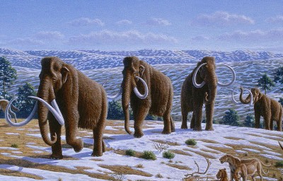
Artist's rendering of woolly mammoths during the last Ice Age
Courtesy of the Public Library of Science, Creative Commons License
Paleoindians didn’t take ecological surveys, and early settlers didn’t have weather stations. So how do we know what conditions were like in northern Wisconsin over the last fifteen thousand years?
Paleoenvironmental, modeled, and historical ecological data can be particularly useful to help understand the climate, fire, or ecological history of a region when no other accounts of land use, climate, or vegetation are available. What we know about northwestern Wisconsin’s ecological past comes from quantitative data taken from a range of sources.
For example, Public Land Survey System data from the mid-19th century has been used to identify forest types in the Midwest and Western states just prior to widespread European settlement. Paleoecological data from fossil pollen and charcoal preserved in lake sediments collected by Sara Hotchkiss and colleagues suggest that in northwestern Wisconsin, the white pine forests reported by the PLS surveyors was not typical of the last 1,200 years, but were likely an artifact of earlier climate conditions. Hotchkiss and colleagues used paleoenvironmental and historical ecology methods to better understand forests on the Wisconsin sand plain during a period of time for which there was no ecological data being collected.
Augment or Help Interpret Qualitative Data
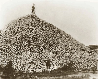
American Bison skulls
Courtesy of the Burton Historical Collection, Detroit Public Library
In The Ecological Indian, Shepard Krech notes that when looking for contemporary accounts of buffalo herd populations:
Estimates of the numbers range widely. Flabbergasted by what they witnessed, some observers were awed into wild, unconfirmable (and clearly wrong) figures from one billion to ten billion buffaloes in a herd or one hundred million animals in a 250-square-mile region.
But:
Over the last century, estimates have been lower—in the thirty to one hundred million range for the total population in AD 1500. Ernest Thompson Seton, the naturalist, was the first to estimate population on the basis of what was called “range allowance” (or carrying capacity). Using different estimates he suggested that in 1500 there had been fifty to seventy-five million bison…and some forty million at the outset of the nineteenth century.
Krech cites first-hand accounts for the contemporary, qualitative estimates, and scientific estimates by non-contemporary experts to contrast with historical estimates by untrained observers. The historical accounts may have been inaccurate for a variety of reasons—lack of ecological training, the desire to hyperbolize to make a better story, or settlers may even have exaggerated unintentionally because they were amazed by what they saw on the Plains.
While neither the qualitative nor quantitative accounts are “true” per se, each estimate offers a different kind of information about buffalo populations and the scale of the impact of Native American hunting practices.
Return to Top of Page
A Primer on Scientific Data
Before you make claims based on quantitative data, it is helpful to have a quick reminder of how the scientific method works. Although the exact steps vary among disciplines, all scientific inquiries have some features in common.
Hypotheses are guesses about how a subject or system works.
Predictions describe what might happen if the hypothesis is true.
Experiments test whether the predictions or hypothesis is true.
Observations, which can include measurements, record the results of the experiments.
What’s important to remember is that science works by trying to prove hypotheses wrong. It takes only one incorrect example to prove a hypothesis wrong. On the other hand, proving a hypothesis correct is nearly impossible, because to prove it correct you’d have to show that every single case in the universe worked like your hypothesis. For example, take the hypothesis, “All students at UW study environmental history.” It’s very easy to prove this statement wrong—all you’d have to do is find one student who doesn’t study environmental history. On the other hand, to prove this statement was correct you’d have to check with every student at UW and see what they study. If you found 98% of the students study environmental history but you weren’t sure about the other 2%, then it’s difficult to prove that your hypothesis is absolutely correct. You could make a solid argument that your hypothesis was correct, but you couldn’t prove it without asking every UW student.
Why does this matter? It matters because the scientific method leaves a lot of room for uncertainty. Scientists are not able to prove every theory or hypothesis correct, but in the absence of any contradicting evidence, many hypotheses are assumed to be true until proven otherwise. Keep this in mind when you are relying on scientific data. In addition, scientific measurements and observations rarely give crystal clear results (especially in the environmental sciences), so conclusions will often have a measure of uncertainty. Scientists are accustomed to this and have devised a number of tests to reduce that uncertainty, or at least to numerically demonstrate when the uncertainty is low.
Return to Top of Page
Lies, Damned Lies, and Statistics
“Figures often beguile me, particularly when I have the arranging of them myself; in which case the remark attributed to Disraeli would often apply with justice and force:
‘There are three kinds of lies: lies, damned lies, and statistics.’"
---Mark Twain, "Chapters from My Autobiography," published in the North American Review, No. DCXVIII
“A psychiatrist reported once that practically everybody is neurotic. Aside from the fact that such use destroys any meaning in the word ‘neurotic,’ take a look at the man’s sample. That is, whom has the psychiatrist been observing? It turns out that he has reached this edifying conclusion from studying his patients, who are a long, long way from being a sample of the population. If a man were normal, our psychiatrist would never meet him.”
---Darrell Huff, How to Lie with Statistics
You may encounter a number of statistics when using scientific data. The goal of this section is to explain some of the most common statistics you will encounter: averages, standard deviations, correlations, and significance. For a more thorough treatment of ways to use statistics (some uses more ethical than others!), see “Suggested Reading” at the end of this document.
Averages and Standard Deviations
The most common statistics you will see are probably averages and standard deviations. An average is the arithmetic mean of a set of numbers. To calculate the average of a set of values, you add them all up and divide by the number of values. Averages do not represent the most common value (that’s called the mode) or the value in the middle (called the median). Averages do represent the general magnitude of your data points. As an example, the average SAT score of college-bound seniors this year (according to www.collegeboard.com) on the math portion of the SAT is 515. This means that approximately half the seniors scored higher than this number, and about half scored lower. The average gives you a reference point from which to think about other people’s scores.
A little more interesting is if we look at the standard deviation of the data. The standard deviation is a measure of how spread out the data are. For example, the average math SAT score could be 515 if everyone received 515. In that case, the data are not very spread out. On the other hand, the average could also be 515 if half the students scored 600 and the other half scored 450. In that case the scores would be more spread out and would have a higher standard deviation. There are more mathematical uses of standard deviations; we’ve put some books in the suggested reading at the end of the page.
Correlation, Causation, and Significance
One such measurement is a value called R-squared. An R-squared value can indicate the extent to which two variables are correlated. The higher the R-squared, the more strongly the variables are related to each other. R-squared values can range from zero to one, though in environmental sciences they never reach as high as one. For example, look at the data below. (These data are generated using the regression in Schindler, 1977.) 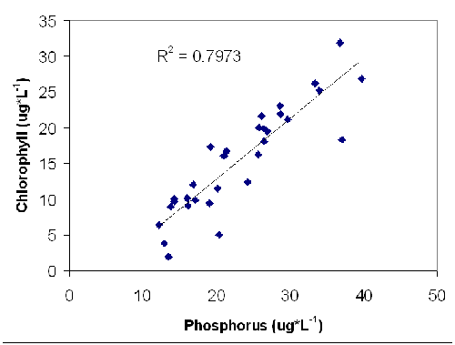
This is a graph of the amount of phosphorus and the amount of chlorophyll in a lake. In this graph, you can see that when there is more phosphorus there is also usually more chlorophyll. Why might this happen? The scientist’s hypothesis was that algae in the lake were limited in their ability to grow by the amount of phosphorus available. The scientist’s prediction is that adding more phosphorus would enable more algae to grow. The experiment was to add extra phosphorus to a lake and the observations recorded the amount of chlorophyll present (which is a measure of the amount of algae, since algae produce chlorophyll).
The line through the equation is a regression line which tries to measure the correlation between phosphorus and chlorophyll. The R-squared value is actually a measurement of how close the data points are to that line. If the R-squared value is one, then the data points are exactly on the line. Since the data points in this example are scattered around the line, the R-squared value is less than one. However, an R-squared value of 0.7973 is still very high for the environmental sciences, and probably indicates a clear correlation between chlorophyll and phosphorus.
The R-squared value explains the percentage of variance in the independent variable that is explained by the dependent variable. In the phosphorus/chlorophyll example, the R-squared value of .7973 means that 79.73% of the variation in phosphorus can be explained by the amount of chlorophyll present. The remaining 20.27% of the variance is (for now) unexplained.
Look at the graph below for a contrasting example. In this graph there are two variables that you would not expect to be related: the amount of phosphorus in a lake, and the number of pirates on Lake Mendota. Because these two variables are not related, the R-squared value is very low, 0.0538, indicating that there is probably no correlation between the two variables. 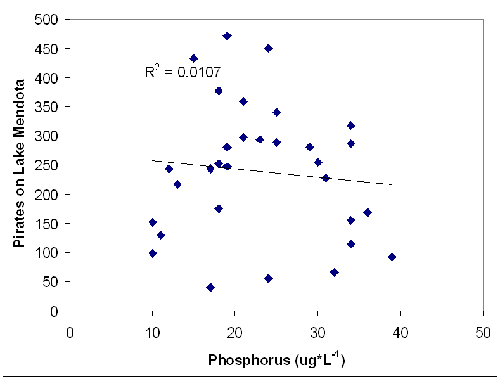
Just to complicate things a little further, even if there is a correlation between variables, it may not be statistically significant. People who do statistical analyses (such as the regressions you’ve been seeing) will also calculate a p-value. Essentially, the p-value is a number that represents the likelihood that the correlation you are seeing is wrong or is insignificant. This means that the smaller the p-value, the more likely that your correlation is statistically significant. Many scientists use a cutoff value of p=0.05. Values less than this are assumed to mean the correlation is significant; values higher than 0.05 mean the correlation is insignificant. In short, the smaller the p-value is, the more likely the relationship is true.
When looking at scientific data, you should think about how reliable the data or conclusions are. In general, the more data points (pieces of information) are available, the more reliable the conclusion will be. In the example above, there are 30 data points, which is generally considered the minimum for making conclusions. More data are almost always better. If the graph above only had two data points, it would make a less convincing argument that chlorophyll and phosphorus are related.
As you explore more scientific data related to your research, you should be aware that just because two variables are correlated, that does not mean that one variable causes, or is caused by, the other. Scientists have a phrase: “Correlation does not equal causation.” Look at the example below (data taken from www.venganza.org): 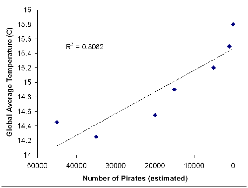
In this example, two variables (global average temperature and number of pirates) are graphed. They are clearly correlated with each other (R-squared=.8082), but logically there is no reason why a decrease in the number of pirates should cause an increase in the global temperature. This is an example in which the graph has a high R-squared value, indicating correlation, but there is no logical significance to the graph. Unlike the phosphorus and chlorophyll example, in which changes in one variable induced changes in the other, this case has no causation. Pirates are not causing global warming! Further investigation shows that the data were taken from an online letter to the Kansas School Board with a clearly political agenda. The moral of the story is: check your sources. Make sure you are using appropriately rigorous scientific sources, and make sure that the results you are looking at make sense. The second moral of this story is: correlation is not the same as causation.
Return to Top of Page
Observations
- Many of the quantitative data you encounter will be based on scientists’ observations of experiments or conditions in the field. These data can be about almost anything, from measurements of tree girth and tree density to precise chemical measurements in the lab to psychological surveys about consumer behavior. These data could also take the form of results from experiments. There is really no limit to the different sorts of observation-based data. Fortunately, these data are often found within a discipline-specific journal, so if you know where to look, you won’t need to wade through (too much) unrelated information.
Models
- Scientists use models to help them simplify certain situations and find explanations for how things work. There is a saying among scientists that “All models are wrong, some are useful.” (Credited to George Box.) Models do not tell you exactly what happened or what will happen in a particular situation. Instead, models give ideas about how a system may work. We all use models in our daily life. For example, you know that the sun rises and sets every day. In your head you have a model that tells you this is because the earth is rotating on its axis. You have probably never left earth to observe its rotation and check this model of the solar system, but you believe this model because it successfully explains how the world around you works. Scientific models are similar; they are used to explain why certain things happen. Models may be wrong, but they help scientists better understand their subjects. Models can be used to generate data, or pieces of information. These pieces of information differ from observations, and should not be taken as fact. Instead, imagine them as a simulation or a guess about how a system might work. Model data are most useful for illustrating how a mechanism or subject works, and least useful for making specific predictions.
Time Series Data
Sometimes scientists collect data over time. These data are collected over regular intervals (if possible) and are commonly referred to as “time series” data. They can be very powerful for demonstrating environmental changes over time. The following data were taken from the North Temperate Lakes Long Term Ecological Research program. 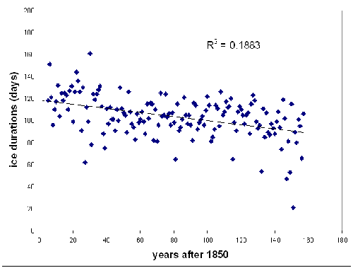
This is a graph of ice duration on Lake Mendota from 1850 to 2007. From the graph, you can see that the length of time that the lake is covered in ice has decreased since 1850. Displaying data over time is a powerful way to illustrate historical change.
Note that in this example the R-squared value may seem low (0.1883). Just because it is low, however, does not mean that it is not useful. The p-value for this data set is likely to be low, indicating a statistically significant relationship. This graph is saying that 18.83% of the variance in ice duration can be explained by the year in which measurements were recorded.
Spatial Data
In addition to data that are collected over time, many scientists collect environmental data over space. These data can be especially useful for environmental historians looking at landscape dynamics, transportation networks, population changes, climate change, etc. Spatial data can be as simple as aerial photographs, or they can involve complicated statistics. If you’re unsure about how complex your spatial data are, consult a scientist or statistician for advice.
What Types of Data Might I Need?
Here are some examples of student research questions and the types of quantitative data that might be helpful.
- If you study ecocriticism and American poetry, you might be interested in a time series of journal articles using the word "ecocriticism,” or you could run the text of poems through content analysis software to search for common keywords used in poems about the environment, which you could then analyze for statistical relationships.
- If you were interested in the history of monuments and built environments in the Midwest, you might be interested in visitor records kept by park officials, which often include information on how far visitors traveled or how much money they spent (and on what). You might also be interested in data about where the various resources used to build monuments, including how much of a particular material (lumber, stone, etc.) were used, and where those materials came from.
- If you were interested in the history of water governance, you might be interested in rainfall and stream flow data over time in a particular area. You might also be interested in records of water use or billing, measurements of aquifer depth, or climatic data on droughts or floods.
- If you were interested in agro-food systems and social change, you might look at historical diet data (how many pounds of beef, milk, etc., did Americans eat per year?), annual crop cover, planting and harvest dates, economic trends in crop price, rural to urban migration, or trends in farm size over time.
Return to Top of Page
Finding Quantitative Data
Once you discover you need scientific or quantitative data (think back to the sample questions at the beginning of this page), where do you find it? If you were to look up the notes for the passage on hamburgers from Steinberg’s Down to Earth discussed above, you might be surprised to notice that he wasn’t citing primary sources. Instead of referencing corporate records of McDonald’s beef purchases or sociological studies of American eating habits, Steinberg’s footnote leads to two more secondary sources:
Margaret J. King, “Empires of Popular Culture: McDonald’s and Disney,” in Ronald Revisited: The World of Ronald McDonald, ed. Marshall William Dishwick . Bowling Green, OH: Bowling Green University Popular Press. 1983.
Vidal, John. McLibel: Burger Culture on Trial. New York: New Press. 1997.
While secondary literature often references quantitative data, such sources are probably not what you’ll want to cite for your own analyses. In the case above, you’d actually be citing a secondary source from 2002 citing a secondary source from 1983, and so on. The bibliography section of Down to Earth can be an excellent starting point if you’re interested in sources about the environmental history of the United States, but at some point you’ll want to search for quantitative data from a primary or other authoritative source.
It is worth noting that the data you’re interested in may not actually be available, and you may decide to collect it yourself. There are a number of excellent texts on quantitative methods for natural and social scientists (including statistics), which we have included at the end of this page. We highly recommend taking courses in quantitative research methods if you plan on collecting your own data. For our purposes, however, we will assume that you are interested in querying existing databases in order to find scientific and quantitative data that is relevant to your research question.
Quantitative data are available for academic use in a wide array of formats and sources, ranging from scientific publications of original research to government databases. The former are more likely to be found via the gated web (i.e. stored in databases that may require institutional subscriptions to access them), while the latter are often readily available for public use—if you know where to look.
Government Agencies
Government agencies are a goldmine of data, ranging from cotton production in Arkansas in 1908 to blood lead levels of school-age children in Milwaukee, Wisconsin in 2008. As agencies are publicly funded institutions, their data are often much easier to obtain and use compared with other sources. Data may be in raw formats, such as an Excel file or table, or may be visualized as a graph or map.
Government data are discussed at length on the Government Documents page of this website, but here are a few sources of quantitative data from Internet sources:
National Oceanographic and Atmospheric Association:
www.ncdc.noaa.gov/oa/ncdc.html
NOAA’s National Climatic Data Center (NCDC) holds the world’s largest archive of climate data, including land-based, marine, paleoclimate, and satellite data. Many of the data are historical, and paleoenvironmental data can be used to reconstruct climates and environments extending back to the last ice age. Many of these data are free for download, or can be purchased for a nominal fee. Find out exactly how “dry” the Dust Bowl was in Lincoln, Nebraska!
Environmental Protection Agency:
www.epa.gov/epahome/data.html
The EPA website is an environmental data clearinghouse, including geographic information systems data, consumer-specific information, and dozens of databases on air and water pollution, toxic waste, etc., searchable on a range of spatial and temporal scales. They also include pages on how they organize their data.
United States Geological Survey:
www.usgs.gov/
The USGS is a governmental agency that collects biological, geographic, geological, hydrological, and geospatial information. Their website includes pages for geographic data in GIS, maps and geospatial data, water data for the nation, earth science data, Landsat satellite data, and USGS digital elevation models.
U.S. Fish & Wildlife Service:
www.fws.gov/data/
The FWS’s geospatial data inventory includes both state and national data sets, including fire, elevation, and vegetation. Their Biological Data Sources web page includes many of the sources of data used by the FWS, including external data sources such as the Nature Conservancy and the Journal of International Wildlife Law and Policy.
United States Department of Agriculture:
www.usda.gov/
The USDA provides several databases, including PLANTS (a standardized database about the plants in the United States), agricultural data and statistics, and the Production, Supply and Distribution database (a source for current and historical commodities data).
National Aeronautics and Space Administration’s Goddard Space Flight Center:
http://gcmd.gsfc.nasa.gov/
NASA’s Global Change Master Directory includes links to a range of earth science data, including biological, climate, agricultural, ocean, paleoclimate, and land use data.
U.S. Census Bureau:
www.census.gov/
http://dataferrett.census.gov/
United States census data are available through several access tools at the Census Bureau website. DataFerrett can be used to retrieve data across federal and state surveys, including the National Center for Health Statistics, the Centers for Disease Control, and the Survey of Income and Program Participation.
Journal Articles
Peer-reviewed journal articles are the most significant source of scientific data collected, analyzed, and published in the last century. Unlike government data, these data are not as likely to be collected in large clearinghouses, but rather must be searched for using some of the same techniques you’d use to look for books or articles. Journal articles are also likely to be more difficult to access, given that the journal publisher typically holds copyrights.
The large (and occasionally contradictory) body of quantitative data available in scientific publications may initially be overwhelming. Researchers may report different results based on the methods used or the scale of their studies. Every year, new work is published on the foundation of the old, and the publish-or-perish environment of academic science can result in a much faster turnover of ideas than those of other disciplines. Keep these disciplinary differences in mind as you search, and let them guide you towards the best sources.
When searching databases such as Web of Knowledge (http://apps.isiknowledge.com/) (see the Search page for details on how to do this effectively), remember these tips:
- Use smart keywords—search both geographically and topically. Don’t be intimidated by scientific jargon—chances are, if you want to know what ecologists have to say about the Big Woods of Minnesota, a search for “Big Woods” will turn up plenty of hits.
- Remember scientific names! If you’re interested in the impact of the beaver trade on forest regeneration in New England, you’ll probably be better off searching for “Castor canadensis” than “American beaver.”
- Recent articles are probably better than older articles. Twenty years is a very long time in the sciences. Are you sure that nothing’s been published on flooding rates of the lower Mississippi River since 1982? Hint: Use that older reference as a search seed to see what newer articles reference it. Conversely, check out the references used in recent papers.
- Read review papers! These are often good, accessible introductions to the existing body of literature in a particular field.
How to read a Scientific Journal Article
1. Read the Abstract—this is essentially the entire body of the paper condensed in one paragraph. This should give you an idea as to whether or not this paper is of interest.
2. Read the figures. Scientific data are typically displayed visually, and so a thorough reading of a paper’s graphics will often reveal the essence of its argument. Carefully examine graph axes, map keys, and table headers. Read the figure legend—this is often telling you exactly what you’re looking at. You should be able to narrate what each figure is relating.
3. Read the Introduction if you’d like more background on the study (this functions something like a literature review). Skip the methods section unless you’re really interested in the study’s research design or have questions about how the researchers acquired their data. The results are typically the content of the figures in narrative form.
4. Carefully read the conclusion. This is the section of the paper where the results are explored and interpreted. The study’s significance (and short-comings) is also typically addressed here, and this is usually the most readable section of the paper.
5. Skim the references for other useful sources.
Return to Top of Page
Quantitative data can be a powerful tool for supporting your arguments. Data can lend a different perspective on conclusions you have already reached, or they can lead you in new directions. When you use quantitative data to make and support your claims, there are a few things you should keep in mind.
Interpret Data Cautiously
While quantitative data can lend support to an argument, they do not necessarily tell the whole story or the whole truth. Because quantitative data possess an air of objectivity, it’s easy to assume they are true. However, scientific knowledge is constructed in a particular cultural context and may reflect the conditions in which it was created. For example, one study we know of looked at the number of people who participated in the National Victory Gardening Program in the United States during World War II. The official United States Department of Agriculture statistics indicate that nearly 60% of Americans had a victory garden. This statistic sounds really interesting—look at how many people were gardening! However, upon digging deeper into government records, the authors found that cities and towns reported a much lower level of participation and fewer actual gardens. Because the Department of Agriculture agents were under pressure from the federal government to reach a certain quota of participation, they had incentive to exaggerate the number of participants in the Victory Garden Program. The city and town statistics, on the other hand, were recorded by people whose jobs were not with the federal government, so they had less incentive to exaggerate. Which data set is more accurate? Which reflects the biases of its authors? These are questions to consider when you find multiple data sets. Just because data are quantitative does not mean they are necessarily true. It’s important to consider the cultural context of your data.
Consult with Scientists and Statisticians
When in doubt, consult with scientists. If you’re unsure of what the data mean or if they will be useful to you, ask a scientist’s opinion. Similarly, if you’ve incorporated quantitative data into your argument and narrative but would like an outside opinion, ask a scientist! Statisticians can also be a valuable resource in helping you interpret someone else’s analysis or to develop your own. Even highly-trained scientists seek advice from statisticians, so don’t hesitate to ask one for help if you think you might need it. Scientists can be found at your university, at various federal agencies (the United States Geological Survey or the Environmental Protection Agency), state agencies, and non-profit organizations. Many of these scientists will be happy to help you with your research.
Return to Top of Page
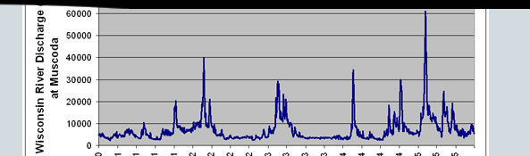
You come across some data through the United States Geological Survey. These data describe changes in the volume of flow in the Wisconsin River over time and may give you insight into Wisconsin’s past climate. The data you are most interested in were collected from 1931 through 1935. In the graph below, discharge is measured in cubic feet per second. Take a moment to study the graph.
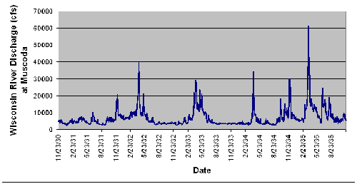
What do those data tell you? The peaks in the lines represent times when the flow in the river was very high. What might have caused this peak in flow? (Hint: probably precipitation or snowmelt.) Does the timing of these peaks in flow correspond to any interesting events in the Wisconsin River Valley? It turns out that there was a dam constructed at Sauk City about 20 years prior to these data, just upstream of where these data were recorded. Could the dam be regulating the river’s flow during this time period? How? What purpose might it serve to have a dam on the river, and how would flow regulation affect life and commerce along the Wisconsin River?
Return to Top of Page
- Do familiarize yourself with the scientific method
- Do try to understand some basic statistics
- Do seek advice from a scientist or statistician
- Do consider the source of your data
- Do back up statements with concrete evidence
- Don’t confuse correlation and causation
- Don’t forget that even quantitative data are uncertain
- Don’t be afraid to delve into scientific literature
Return to Top of Page
Church of the Flying Spaghetti Monster. Open Letter to the Kansas School Board. www.venganza.org/about/open-letter/ (accessed 11/23/2008)
Hotchkiss, S.C., R. Calcote & E.A. Lynch. 2007. Response of vegetation and fire to Little Ice Age climate change: regional continuity and landscape heterogeneity. Landscape Ecology 22: 25-41.
Huff, Darrell. 1954. How to Lie with Statistics. New York: W. W. Norton & Company.
Krech III, Shepard. 2000. The Ecological Indian: Myth and History. New York: W. W. Norton & Company.
Schindler, D.W. 1977. Evolution of Phosphorus Limitation in Lakes. Science 195 (4275): 260-262.
Steinberg, Ted. 2002. Down to Earth: Nature’s Role in Environmental History. New York: Oxford University Press.
Twain, Mark. 1907. "Chapters from My Autobiography.” North American Review, No. DCXVIII.
Return to Top of Page
Agresti, Alan, and Barbara Finlay. 1997. Statistical Methods for the
Social Sciences. Upper Saddle River: Prentice Hall.
Creswell, John W. 2008. Research Design: Qualitative, Quantitative,
and Mixed Methods Approaches, 3rd Edition. London: Sage Publications.
Gotelli, Nicholas and Aaron Ellison. 2004. A Primer of Ecological
Statistics. Massachusetts:
Sinauer Associates, Inc.
Hilborn, Ray and Marc Mangel. 1997. The Ecological Detective: Confronting
Models with Data.
Princeton: Princeton University Press.
Sutherland, William J. 2006. Ecological Census Techniques: A Handbook, 2nd
Edition.
Cambridge: Cambridge University Press.
Return to Top of Page
- causation: the act of causing something
- correlation: a relationship between phenomena, things,
or variables, which is not expected on the basis of chance alone
- p-value: the probability of an event or outcome in a
statistical experiment
- qualitative data: information about the qualities or
properties of something
- quantitative data: information about the quantities
of something
- regression: a relationship between two or more correlated
variables that is used to predict values of one variable when given values
of the others
- significance: the likelihood of being caused
by something other than mere chance
Return to Top of Page
|